Custom Controls Framework - Grids
– 7 MinutesSo far, these posts have focused on field controls, but it's also possible to create grid controls. Grid controls are used to render the table of records on either views or sub-grids on forms. They are very similar to field controls, except that they take a data-set parameter which contains all the details about the rows, columns, filtering, sorting, etc.
In this post, we'll create a grid control which renders the grid as a list of tiles. Note that it is possible to use the "Card Form" property on the Read-Only Grid control to accomplish the same thing -- except that option is much more robust. The control we're creating is just to illustrate what's possible with custom grid controls.
To get started, we'll create the control manifest.
<manifest>
  <control namespace="BGuidinger.Samples" constructor="TileGridControl" control-type="virtual" ...>
    <modes>
      <read />
      <edit />
    </modes>
    <data-set name="Grid" editable="true" ...></data-set>
    <resources>
      <code path="TileGridControl.js" order="1" />
      <resx path="strings/TileGridControl.1033.resx" version="1.0.0" />
    </resources>
  </control>
</manifest>
Notice that instead of setting a bound property for the value like you would for a field control, you instead set a data-set property -- this is what denotes this control as a grid control. You can include multiple data-set's in the control manifest if you want to provide additional records to your control. This is what the Editable Grid control does to support the nested sub-grid.
Just like field controls, you can also set additional input and bound properties if you want the user to be able to configure settings. To keep this control basic, we won't add any.
Next, we'll create the control file. Not much new here -- all the same concepts from field controls apply here. The only difference is that the "Grid" parameter contains some extra properties/functions, including the records in the data-set. We can loop over these to create an element for each row. In this case we're creating a simple container and adding the value of each column to it. (I'll cover the different elements you can create in a future post).
namespace BGuidinger.Samples {
    export class TileGridControl {
        private context;

        init(context) {
            this.context = context;
        }
        destroy() { }
        updateView(context) {
            this.context = context;

            let tiles = this.getTiles();

            return context.factory.createElement("CONTAINER", null, [tiles]);
        }
        getTiles() {
            let grid = this.context.parameters.Grid;

            let tiles = Object.keys(grid.records).map(id => {
                return this.getTile(grid.records[id]);
            });

            return this.context.factory.createElement("LIST", null, tiles);
        }
        getTile(row): any {
            let grid = this.context.parameters.Grid;

            let values = grid.columns.map(column => {
                let value = row.getFormattedValue(column.name);
                return this.context.factory.createElement("CONTAINER", null, [value]);
            });

            return this.context.factory.createElement("LISTITEM", null, values);
        }
    }
}
This will create a basic list with a tile for every record in the data-set. Pretty cool, right? This control isn't very useful though, so let's enhance it by adding additional functionality for filtering, sorting, and paging.
Filtering
The data-set property contains a filtering object which has functions we need to perform filtering actions.
filtering: {
    aliasMap: {
        [name: string]: string;
    },
    canDisableRelationshipFilter(): boolean;
    clearFilter(): void;
    getFilter(): Filter;
    setFilter(filter: Filter): void;
};
From what I can tell, the aliasMap is used to determine which attributes are included in the data-set and can therefore be used in the filtering. To set the filter, we just build up a filter object and pass it to the setFilter function. Make sure you call refresh after or nothing will happen!
getFilter() {
    let grid = this.context.parameters.Grid;

    let onChange = (e) => {
        this.filter = e.target.value;

        if (!this.filter) { grid.filtering.clearFilter(); }

        grid.filtering.setFilter({
            filterOperator: FilterOperator.And,
            conditions: [{
                attributeName: 'fullname',
                conditionOperator: ConditionOperator.Like,
                value: '%' + e.target.value + '%'
            }]
        });
        grid.refresh();
    };

    return this.context.factory.createElement("TEXTINPUT", { value: this.filter, onChange: onChange });
}
Sorting
Sorting is even easier than filtering. The sorting object is just a hash map with the columns that are sorted and the direction they are sorted in. You just set the object directly and refresh the grid.
sorting: {
    [key: number]: {
        name: string,
        sortDirection: SortDirection;
    }
};
A rudimentary element which just switches back and forth between ascending and descending would look like this:
getSorter() {
    let grid = this.context.parameters.Grid;

    let onClick = () => {
        let direction = grid.sorting[0].sortDirection;

        grid.sorting[0] = {
            name: "fullname",
            sortDirection: direction ? SortDirection.Asc : SortDirection.Desc
        };
        grid.refresh();
    };

    return this.context.factory.createElement("BUTTON", { onClick: onClick }, ["Sort"]);
}
Paging
Last but not least, we can implement paging. All of the functions and properties you need are included in the paging property. These can be used to display the current page info as well as navigating to the next/previous page.
paging: {
    pageSize: number;
    setPageSize(pageSize: number);
    firstPageNumber: number;
    lastPageNumber: number;
    hasNextPage: boolean;
    loadNextPage(): void;
    hasPreviousPage: boolean;
    loadPreviousPage(): void;
    loadExactPage(page: number): void;
    totalResultCount: number;
    reset(): void;
};
A basic paging control would look like this:
getPager() {
    let grid = this.context.parameters.Grid;

    let onClick = (direction) => {
        if (direction == 0) {
            grid.paging.loadPreviousPage();
        } else {
            grid.paging.loadNextPage();
        }
    }

    let prev = this.context.factory.createElement("BUTTON", { onClick: onClick.bind(this, 0) }, ["Prev"]);
    let next = this.context.factory.createElement("BUTTON", { onClick: onClick.bind(this, 1) }, ["Next"]);

    return this.context.factory.createElement("CONTAINER", null, [prev, next]);
}
Conclusion
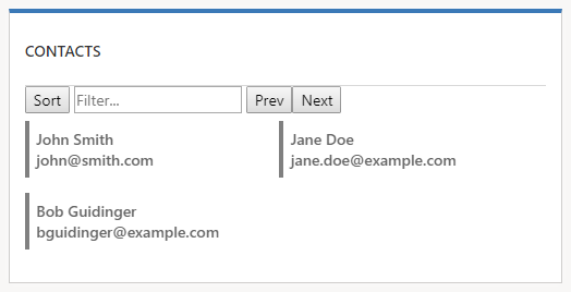
Putting all of this together, you will get a control that looks like this.

It's not pretty, but it does illustrate the key functionality offered by custom grid controls.
You can find the solution for this control here: CustomControls_1_0_0_6.zip.
