
Custom Controls Framework - Properties
– 7 MinutesThis post will explore properties for controls built on the Custom Controls Framework. Properties represent values that can be configured, allowing the user to change how the control behaves in order to meet their needs. This post builds on the previous post, so be sure to check that one out first.
Definition
For field controls, there are two types of properties: bound and input. Bound properties are those that are only bound to the value of a field on the form, and input properties are those that are either bound to a field or allow a static value.
Properties are defined in the control manifest and are specified as child elements under the
As an example, to define that your control has a value that is bound to a Single Line of Text field, you would use the following property definition:
<manifest>
  <control ...>
    ...
    <property name="value" usage="bound" of-type="SingleLine.Text" ... />
    ...
  </control>
</manifest>
However, that means this control only works specifically on Single Line of Text fields with a format of Text. What if you want your control to work for multiple data types? Easy! The data types can be put into a type-group in the control manifest, and then you specify that the property is of-type-group (as opposed to of-type above).
<manifest>
  <control>
    ...
    <type-group name="Numbers">
      <type>Decimal</type>
      <type>Whole.None</type>
    </type-group>
    <property name="precision" usage="input" of-type-group="Numbers" ... />
    ...
  </control>
</manifest>
This property would render like this when configured on a control:
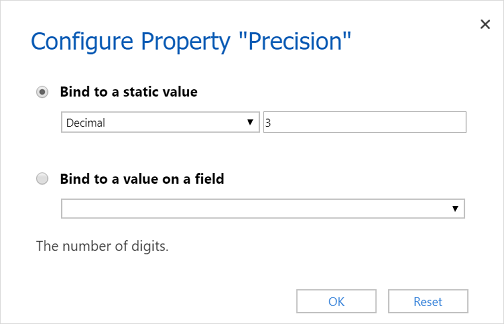
Notice that since this is an input property, we have the option to either specify a static value or bind it to a value on the field. You'll also notice that the fields in the "bind" drop-down are pre-filtered to only those of a type specified in the type-group - thereby preventing you from using the wrong field types.
There are additional properties you can configure for grid controls (i.e. data-set and property-set), but I will not cover those in this post. I'll save that for a future topic.
Data Types
The following table lists the available field types in Dynamics 365 and their corresponding property types. You use the format . to specify the "full name" of the property type when including it in the control manifest (as seen above for SingleLine.Text).
| Field Type | Property Type | Property Sub-Type |
|---|---|---|
| Single Line of Text | SingleLine |
|
| Multiple Lines of Text | Multiple | |
| Option Set | OptionSet | |
| MultiSelect Option Set | MultiSelectOptionSet | |
| Two Options | TwoOptions | |
| Currency | Currency | |
| Decimal Number | Decimal | |
| Floating Point Number | FP | |
| Whole Number | Whole |
|
| Date and Time | DateAndTime |
|
| Customer | Lookup | Customer |
| Lookup | Lookup |
|
There is another type not mentioned in this table, and that is Enum. This type is used to provide a pre-defined list of values for the user to choose from when configuring a property. For example,
<manifest>
  <control ...>
    ...
    <property name="enable" usage="input" of-type="Enum" required="false" hidden="false">
      <value name="Yes" default="true">yes</value>
      <value name="No">no</value>
    </property>
    ...
  </control>
</manifest>
Note: the property and value XML nodes accept a display-name-key and description-key attribute.
Usage
As mentioned in the previous post, the updateView method has a context object passed into it by the Dynamics 365 runtime. This context object contains a property called parameters. All of the properties you define in the control manifest will be automatically provided as properties on the parameters object!
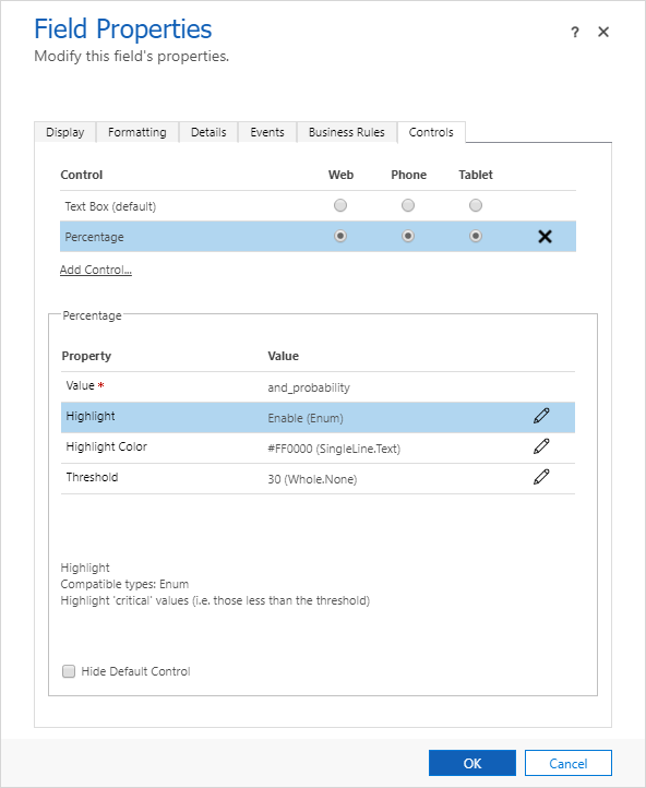
To illustrate this, we will add three properties to the Percentage control -- one to enable/disable highlighting if the value is less than a threshold, one to set the threshold, and one to configure the highlighting color.
First, we'll add the property elements to the control manifest (and create the keys in the PercentageControl.1033.resx file).
<manifest>
  <control ...>
    ...
    <type-group name="Numbers">
      <type>Decimal</type>
      <type>Whole.None</type>
    </type-group>
    <property name="highlight" usage="input" of-type="Enum" display-name-key="CC_Highlight" description-key="CC_Highlight_Desc">
      <value name="Yes" display-name-key="CC_Highlight_Enable" description-key="CC_Highlight_Enable_Desc" default="true">yes</value>
      <value name="No" display-name-key="CC_Highlight_Disable" description-key="CC_Highlight_Disable_Desc">no</value>
    </property>
    <property name="highlightColor" usage="input" of-type="SingleLine.Text" display-name-key="CC_HighlightColor" description-key="CC_HighlightColor_Desc" />
    <property name="threshold" usage="input" of-type-group="Numbers" display-name-key="CC_Threshold" description-key="CC_Threshold_Desc" />
    ...
  </control>
</manifest>
Next, we'll update the TypeScript file to use these properties. We'll add a private method to return a style object...
private getStyle(context) {
    let parameters = context.parameters;

    let highlight = parameters.highlight.raw == "yes";
    let threshold = parameters.threshold.raw;

    if (highlight && this.props.value < threshold) {
        return { color: parameters.highlightColor.raw };
    } else {
        return null;
    }
}
...and we'll call this from the updateView method.
updateView(context) {
    this.props.value = context.parameters.value.raw;
    this.props.style = this.getStyle(context);

    return context.factory.createElement("TEXTINPUT", this.props);
}
After compiling the TypeScript, packaging it up, and deploying to your environment, go edit the control. You'll notice that you now have three additional properties! Configure them and publish the form.
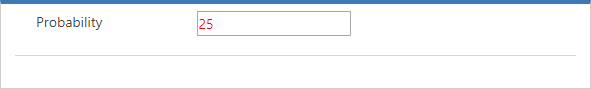
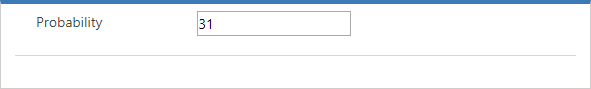
As you would expect, if you look at the control on the form, you'll see that it is red when the value is below 30%, and black when it is above.
There you have it -- a quick primer on properties for custom controls. In the next post, we'll dive a little deeper into styles to see how we can make our control fit in with the rest of the out-of-the-box controls.
The solution for this post can be found here: CustomControle_1_0_0_1.zip.